Frank Mastra
Brand brainstorm.
Frank is the son of a longtime client — I had the pleasure of creating the logo and branding for his family’s oyster farm, Oysterponds Shellfish Co.. When I heard about his growing music career, I was excited to help him start shaping his own visual identity.
With FM as his initials, the concept practically presented itself. I leaned into vintage radio as the foundation, tying in the soulful, classic rock energy behind his music.
Initials that are a creative’s dream.
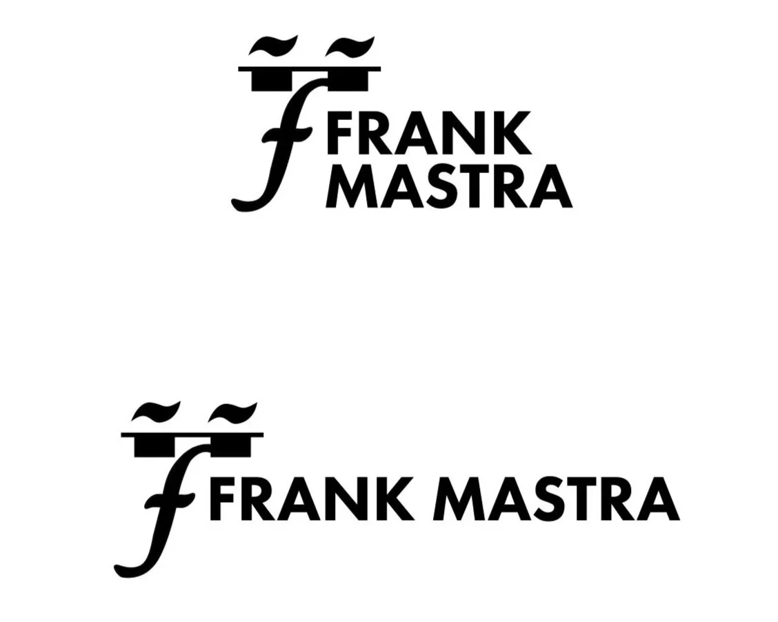
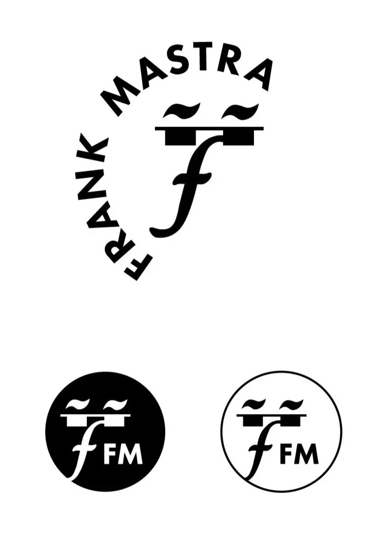
This concept was all about channeling Frank’s soulful, retro sound through design. I used a forte, whole rests, and a mordent to build a stylized face with sunglasses, a playful nod to mid-century modern graphics, Saul Bass and Pink Panther lounge cool.
Musical Components


